The Wirecutter
Winter/Spring 2013
Design Direction & Front-End Design: John Mahoney
Back and Front End Wordpress Build: Craige Thomas
Wordpress customization: Craige Thomas & John Mahoney
thewirecutter.com
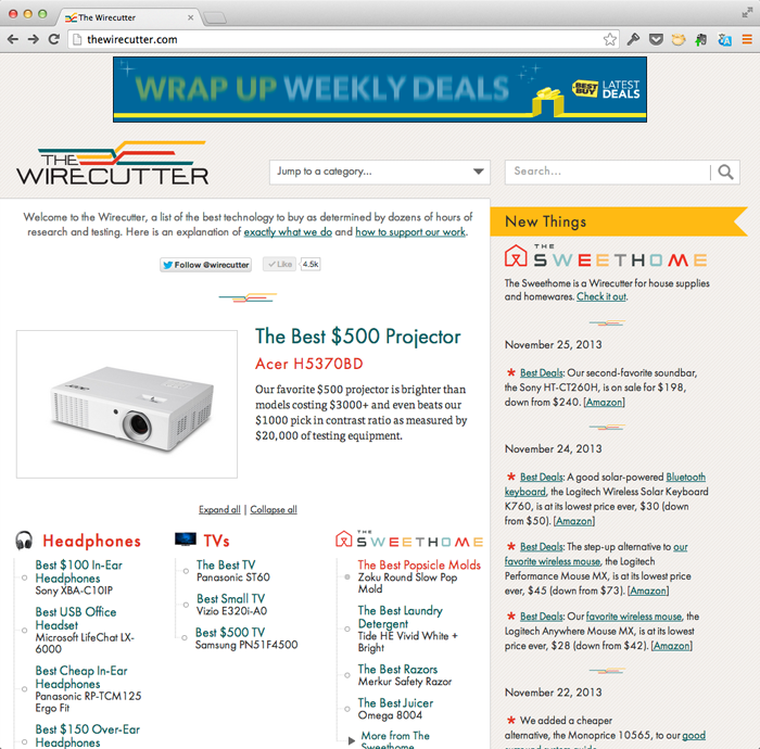
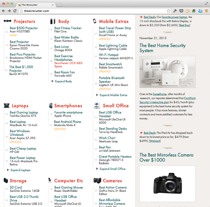
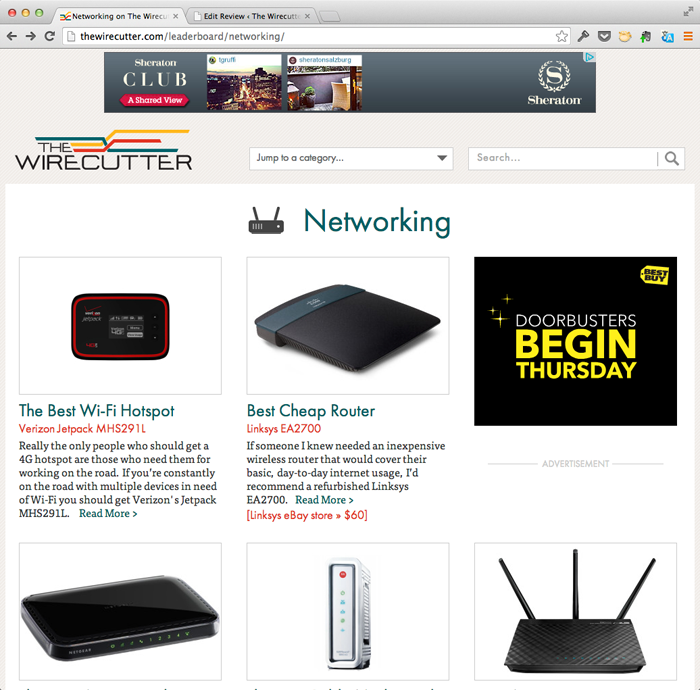
Brian Lam's Wirecutter is probably the most thoughtful gadget site on the web. Rather than flood you with news you don't care about, Brian and his excellent writing staff spend hours combing through reviews, conducting interviews with experts, and doing their own testing to arrive at a single buying recommendation for all the major gadget categories. Need a camera? Just buy this one—it's the best.
It's my favorite kind of site—one that does one thing extremely well, rather than many things with varying degrees of competence—so when Brian came to me looking for a redesign, I was thrilled at the chance to make one of my favorite sites even better. The site's editorial strategy was already well-formed and working—it just needed a clean design that matched and reinforced the clarity of the content.
Aside from a top-to-bottom visual clean-up, the major new feature on the new Wirecutter is the ability to widgetize any product mention and insert it both into the body text and into the sidebar. Since the research summary that accompanies each guide is often lengthy, Brian wanted to make his pages more effective at delivering all the relevant information to those who only have time for a quick skim. To do this, we created a flexible system that automatically pulls in information from Amazon's product API for any given gadget and displays an embedded widget. Flexible fields for display text and button color make it clear whether the alternate product is a step up, a step down, or something to ignore entirely, all while keeping the overall look uniform and clean.


